
Intuit, Mailchimp: Integrations store.
Role: Lead user experience designer Timeline: 1-3 months Tools: Figma, Jira Collaborators: Product manager, Stakeholder, development team, QA


My role
In Q1 of 2024, I was tasked with strategizing and re-designing a consistent user experience, workflow, and content pattern for all integrations so that the business could increase the number of integration installations and the overall usability of our sites.
Each integration had a unique interface & workflow for the installation process, this led users to experience cognitive overload which caused up to 35% of users to abandon the completion of the installation process. We found that up to 30% of users found outside resources to aid in completing integration installations.
Objective
I aimed to increase the cognitive proficiency of users using the integration store by not only designing a consistent UI/workflow but by strategically designing interactions that familiarize users with locating important features like installation steps, integration resources, etc. I worked with a product to build a roadmap aimed at re-designing 3-4 integrations a month until all integrations reflected the new re-design, workflow, and content pattern.


Discovery
In usability testing and user research sessions, I discovered there was a disconnect between our users and the usability of the integration store application.
35% of our users were unable to comprehend how to use the existing integration stores workflow and had a hard time interpreting its information and content. 30% had to utilize outside resources to assist in comprehending how to install apps to Mailchimp and 25% of users experienced long and tedious workflow interactions before completing instalations.
When users experienced a disconnect they would do the following:
abandon purchasing OR installing the integration
Call/Visit Mailchimp Help Center
Cancel Mailchimp subscription due to cognitive overload
locating outside resources such as Google search to aid in completing integration installations.
Hiring business consultants to their staff to assist in utilizing the Mailchimp tool
User interviews:
Timeframe: 2 recurring meetings per week for each user group over 1-2 weeks.
I conducted a series of user interviews with stakeholders and primary users of the tool to learn about their current workflow and the pain points they experience when interacting with the tool. Our users are mainly small to mid-level business owners OR large enterprise corporations.
Usability testing & User Sessions:
Timeframe: 2 recurring meetings for each user group over 1 week.
After gaining a sense of the tool, I conducted user sessions to dig deeper into the root causes of the existing pain points.
At a high level, these sessions allow users to specifically identify where pain points occur in the workflow, define where things are going wrong vs where they are going right, and gain an overall sense of what the user expects to accomplish when navigating through the application. The second half of the session is dedicated to understanding the primary information users are expecting to see vs the secondary information, it is important to verify with users what data/info is high priority vs med-low priority. This sets the tone for how I plan to scale and encapsulate data visually in the newly designed app. After collecting Feedback, I inform users of the next UX phase & give them an idea of what to expect and how to prepare.


User problem / Define Analyze Business REQ’s
The pre-existing workflow struggled with a few usability issues.
Users frequently experience cognitive overload when attempting to install integrations to Mailchimp. Users were forced to learn different integration workflows that were uniquely different across all applications, this caused users to abandon completing installation processes and integration purchases.
Users had trouble locating helpful and relevant resources to aid them in the installation process. (Installation steps, videos, feature information, etc) Instead, they utilized outside resources such as Google search, called/visited the Mailchimp help center, or hired business consultants to assist in completing the workflow.
Users frequently experienced interactions with broken resource links that would point them to error message screens or would direct them nowhere at all.
( Please view an example of our pre-existing workflow for the Mailchimp integration store)
Pre-existing workflow
-
![]()
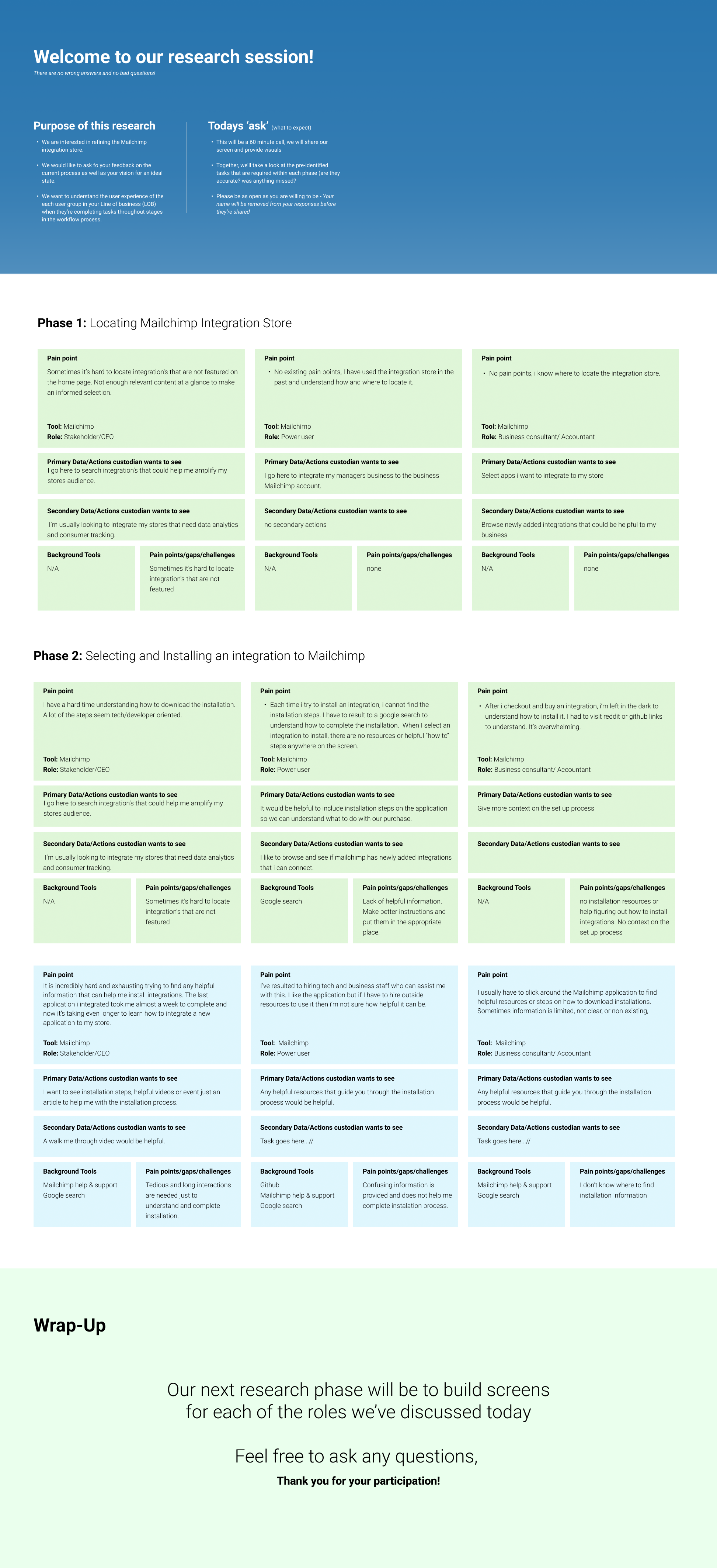
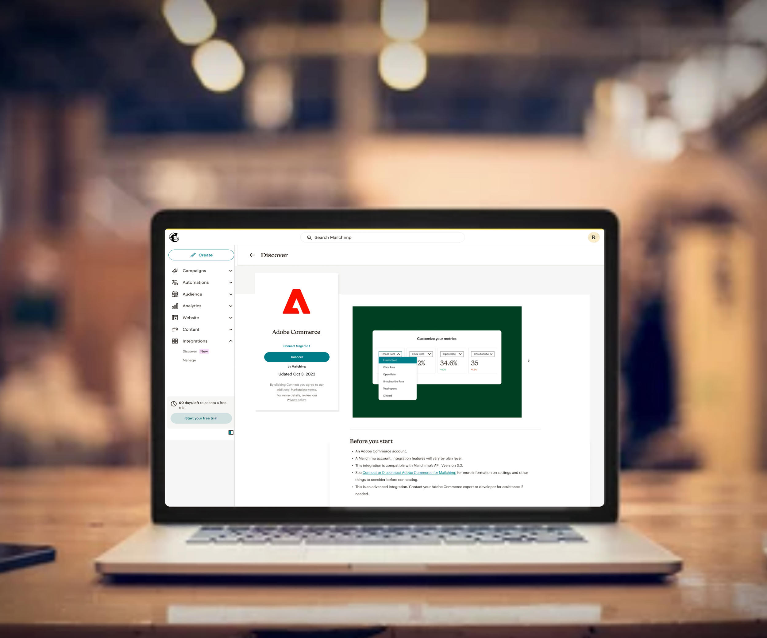
Unique user interface
Adobe commerce previously had it’s own unique UI and content pattern that was not consistant with otherapplictions.
-
![]()
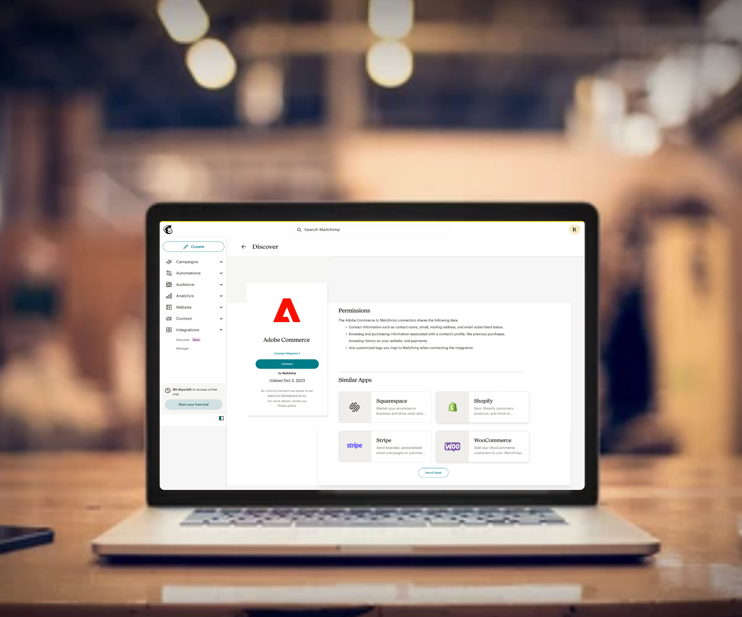
Feature information
The application offered information about potential features users could use but DID NOT include information relative to installing the integration.
-
![]()
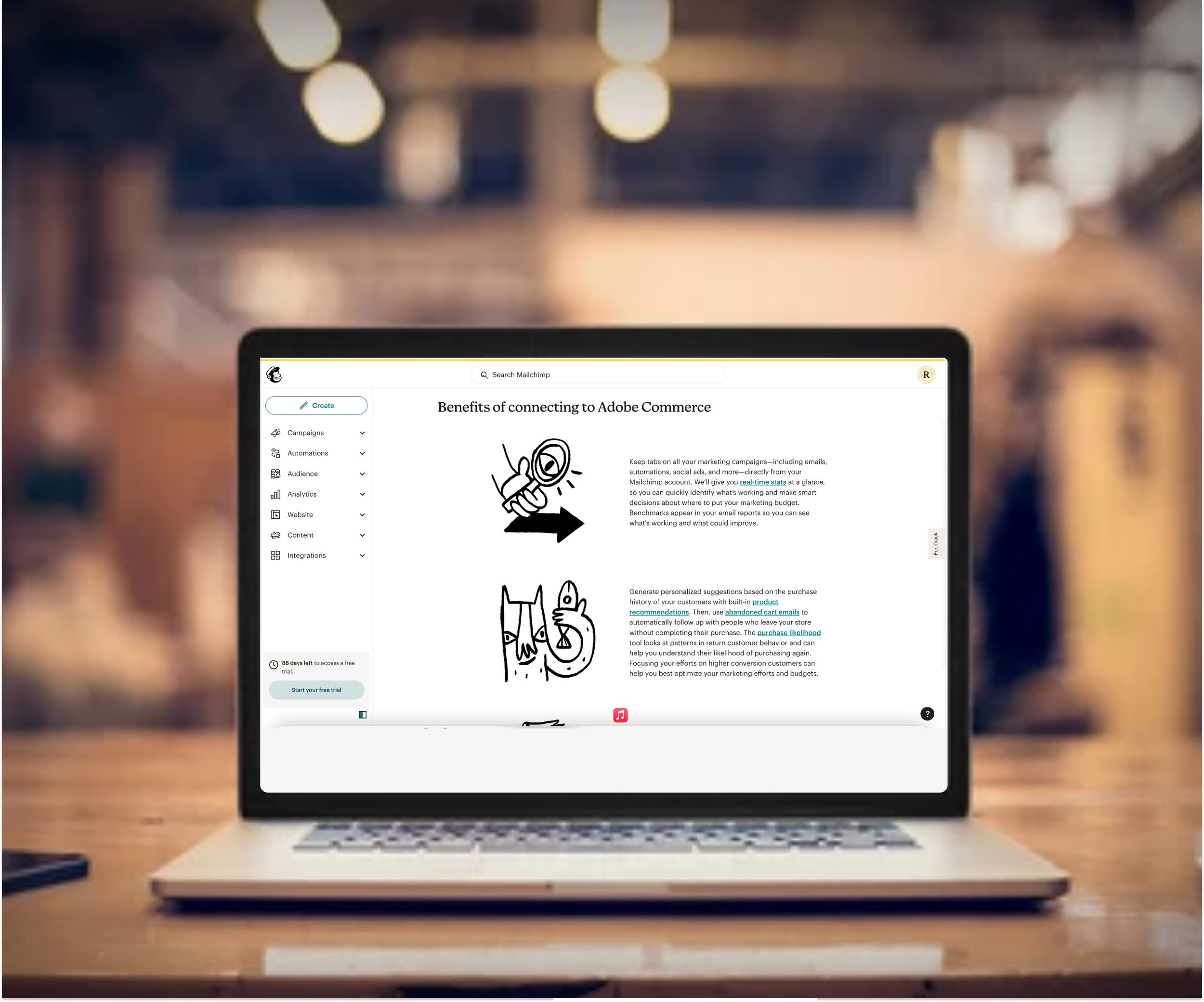
Lack of installation Resources
Often, integrations lacked resources for installing integrations. When resources were provided, users were redirected to error message screens.
-
![]()
Broken Resource Links
Often, Resource links would be non existence or they would be broken URL links.


Ideation / Prototype
How can we enhance the usability of the Mailchimp integration stores user experience? How can we make the application more useful?
Information Architecture & Visual Hierarchy
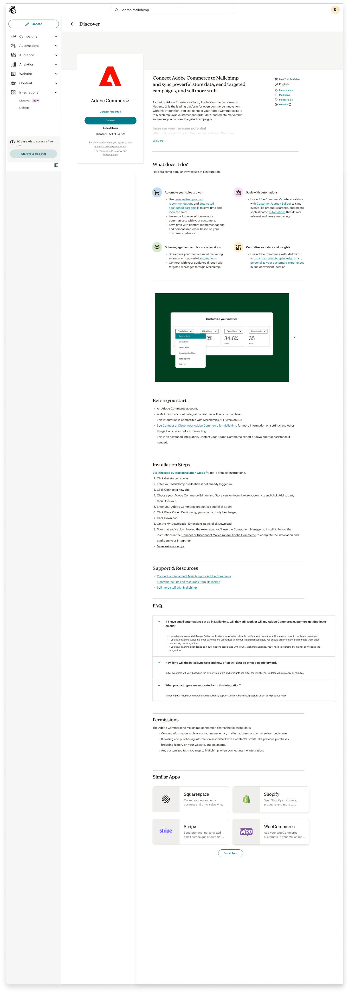
Installing integrations can be rigorous but now that each application will have a consistent design pattern and workflow, users will now have familiarity with where to find this information on each application. Creating a visual hierarchy structure improves readability and helps users digest complex information. The structure of each integration interface will now include the following sections.
Hierarchy:
What does it do > Before you start > Installation steps > Support & Resources > FAQs> Permissions > Similar apps.
Adding installation steps and resources within the integration selection experience:
In the new Installation steps section, usability can be improved by adding a content pattern that is easily digestible for users when completing installation steps. The steps will be a numbered array of tasks for users to follow to complete the installation from start to finish. The primary task of the user is to install the integration, so including steps relative to this task should be a high priority. In the event our users need further instruction, I partnered with content to locate helpful resources relative to the integration steps and resources on features that we could add in the “Support & Resources section. In the “What does it do” section, I re-designed the look & feel of the features available for the integration & included a concise explanation of what each feature does.
Preparing users for pre-integration steps & shared data
Installation steps and “walk me through” videos cater to both visual and written audiences, increasing the accessibility for our wide range of users.
In the pre-existing user flow, users would frequently hit dead ends in the installation process, they were met with errors during the installation process due to not having the correct APIs, permissions, and versions. Users will now receive this information in the “Before you start” section of the app.
Before integrating, users were unaware of what data would be shared. To comply with transparency, we let users know before installation if their contact information, browsing, purchasing, and customized tag data would be shared. Users will no be able to locate this information in the “Permissions” section of the app.
New workflow
-
![]()
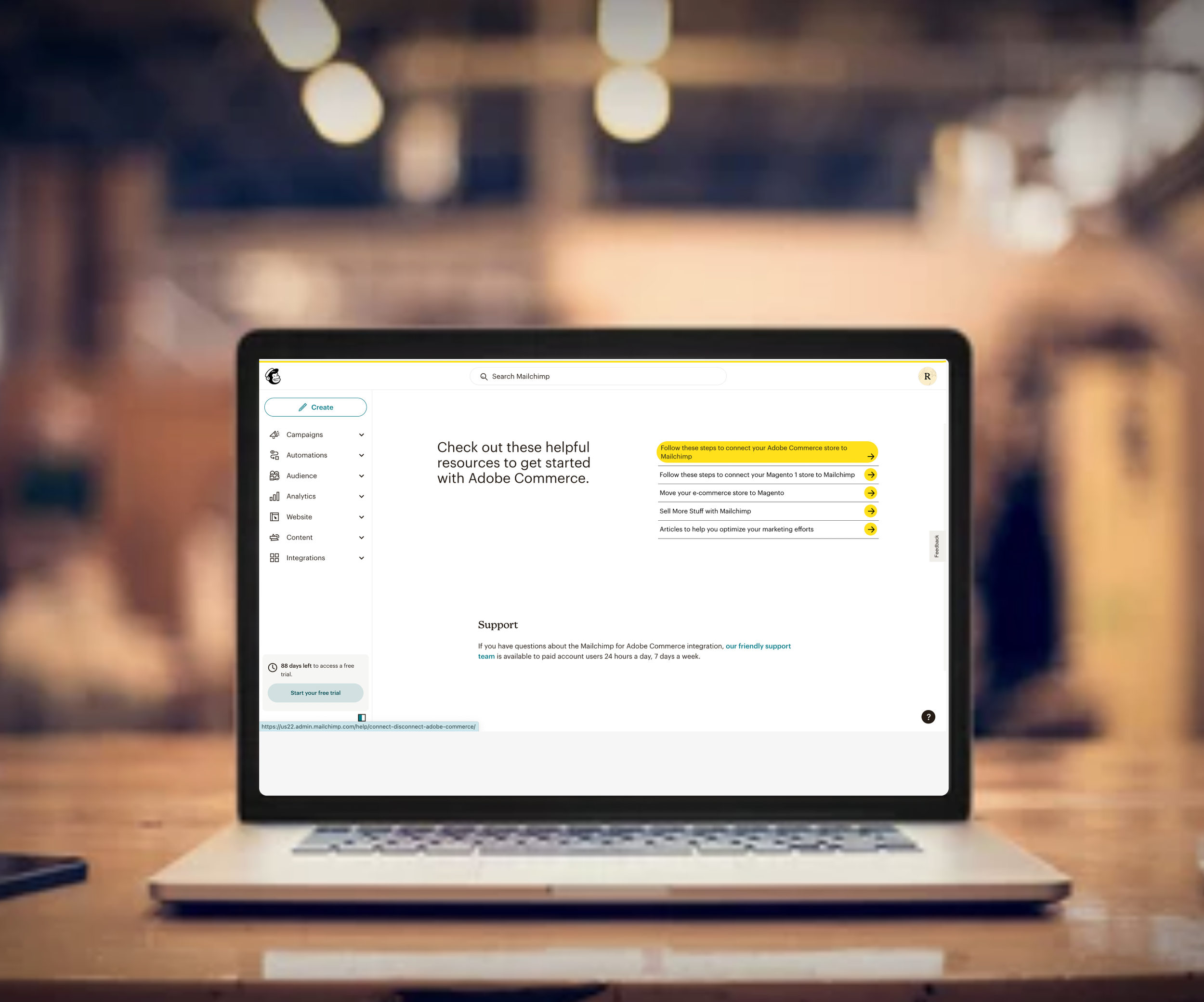
Consistent user interface
All new itegrations will have a consisten and familiar user interface design and content pattern.
-
![]()
Accessibility
All integrations will have both written and visual content. All content and videos will now be accesible to screen readers.
-
![]()
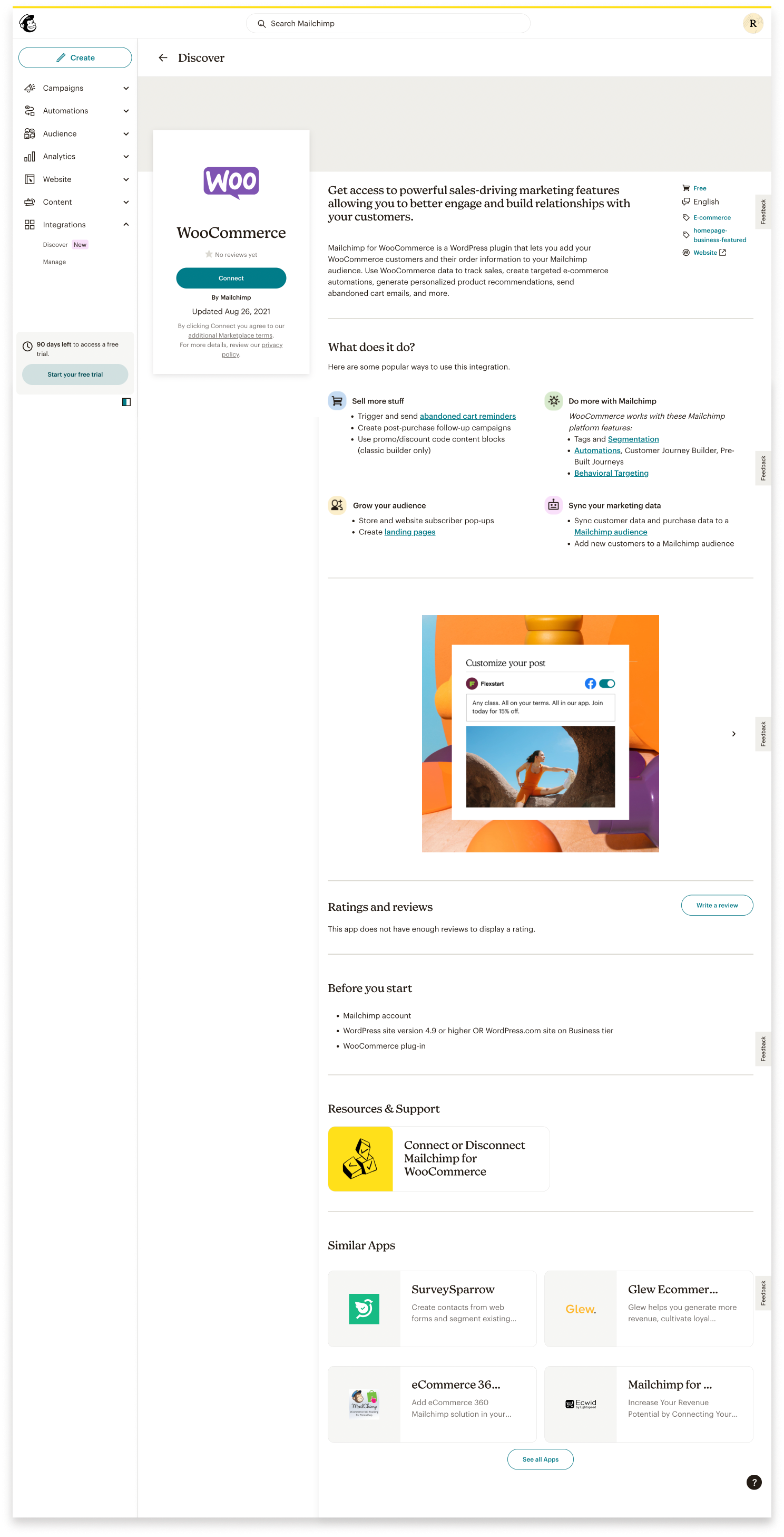
Installation steps and Resources
Each integration will included numbered installation steps and a list of relevant resources.
-
![]()
Recommended integrations
At the end of each screen, users will be given a list of recommended integrations to install.


Outcome / Release.
In collaborating with stakeholders, development teams, and product managers, I was able to design an overall high-quality product that was useful, useable, and accessible. I tested the new design prototype with users and found that the cognitive proficiency of using the tool increased by over 90%. Less than 8% of users left the application to utilize outside resources to assist in completing the installation process. 98% of users knew exactly where to find installation steps and resources.
Currently, 20% of our integrations have been updated to the new design. I plan to update 3-4 integrations a month until all integrations are updated with the re-design.
Click the following links to visit the live site of the redesign: Wix, WooCommerce